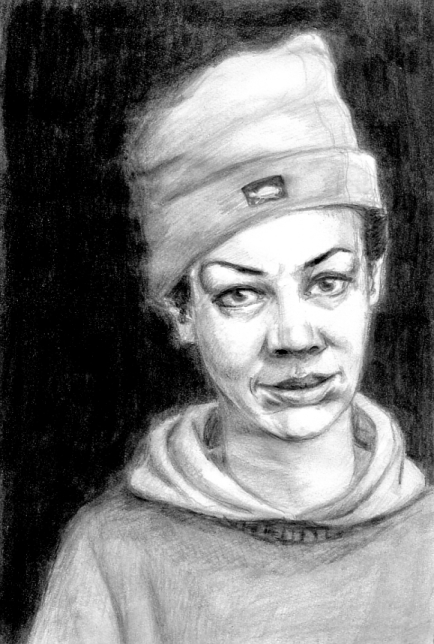
water-soluble graphic pencil portrait
water-soluble graphic pencil portrait
Drawings and Paintings
water-soluble graphic pencil portrait
water-soluble graphic pencil portrait
This site uses Akismet to reduce spam. Learn how your comment data is processed.

I like this self-portret. It’s very expressive.
LikeLike
Thanks so much. Glad you came to visit.
LikeLike
good portrait. i think the black background needs to be darkened a lot around the figure. it fades, making it appear fuzzy. if you made the transition crisper it would make for better contrast. also, i would add a lot of darks to the creases of the hood, the wrinkles in the hat, and right below the brim of the hat.
LikeLike